Scope
Research & Strategy
Through competitive analysis, I identified that most rental services communicate in extremes: either overly corporate without personality, or design-focused without clear service descriptions. Property owners needed to quickly understand what's included, trust the expertise, and see tangible benefits.
I positioned Stage and Stay to bridge this gap: premium but accessible, benefit-driven but not salesy. The content strategy leads with aspirational messaging while backing it up with concrete service breakdowns and social proof.
The site architecture prioritizes clarity and decision-making. The homepage establishes both core services equally, dedicated service pages dive deep into specifics with consistent templates, and every page guides users toward one clear action: booking a consultation.
Design Process
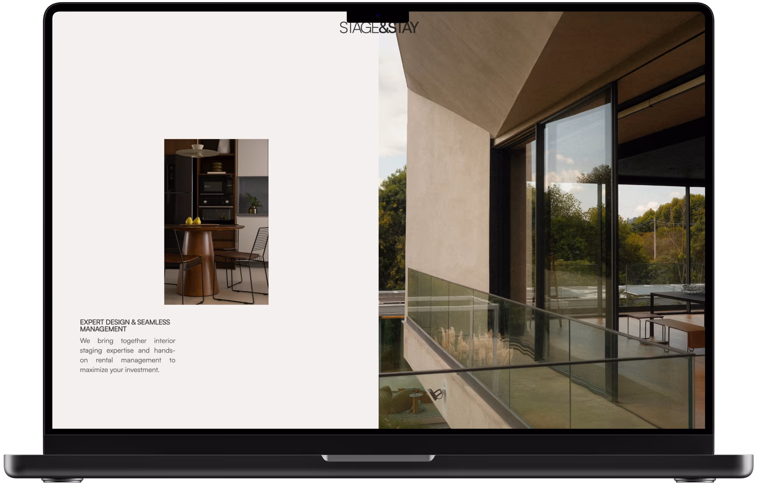
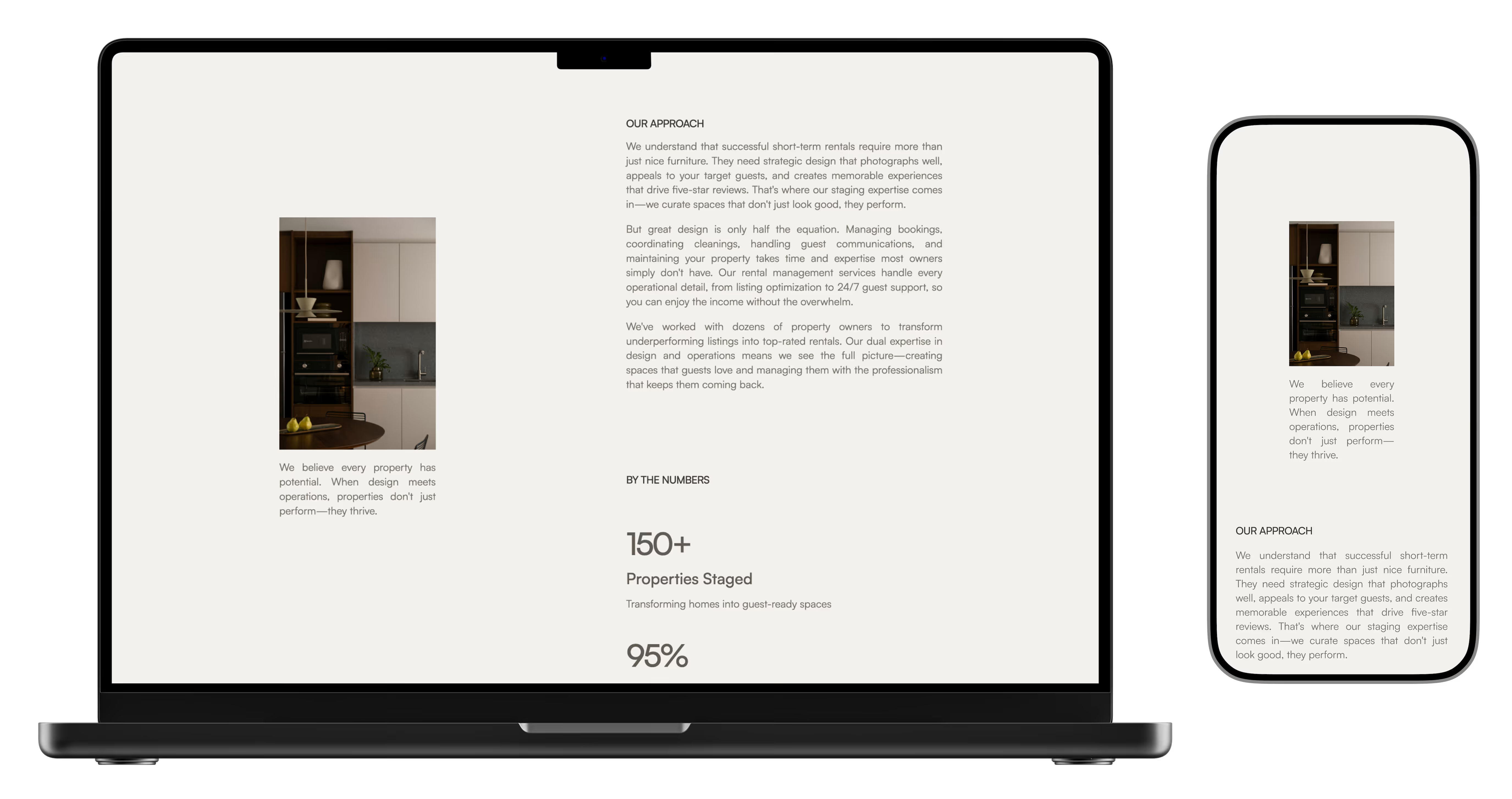
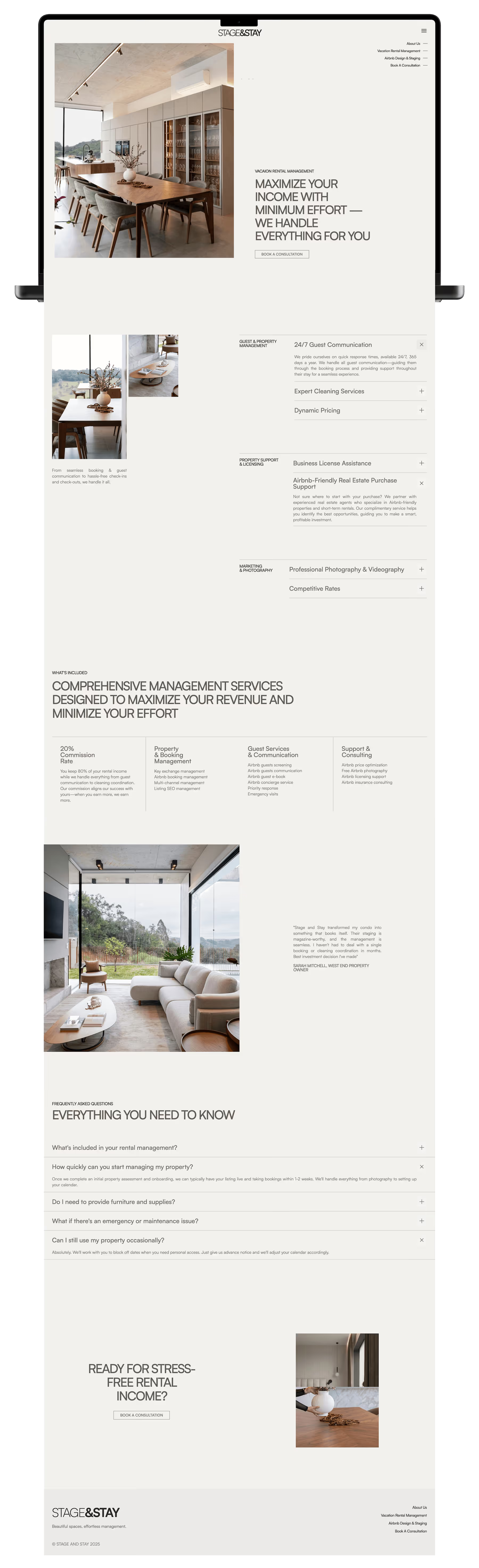
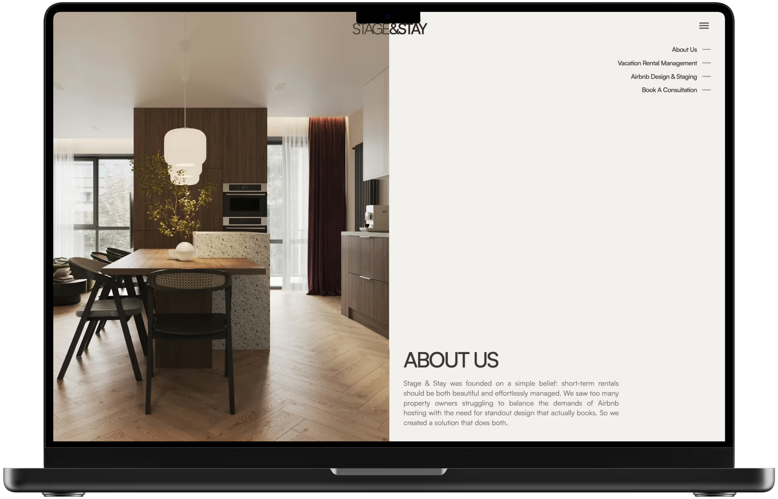
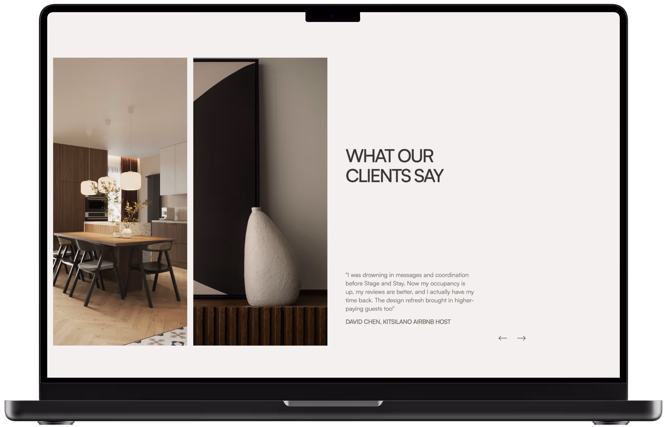
I created a magazine-inspired layout that balances large-scale photography with generous white space. The asymmetric grid system creates visual interest throughout each page while remaining easy to scan. This editorial approach elevates the brand above typical service websites, communicating sophistication without sacrificing usability.
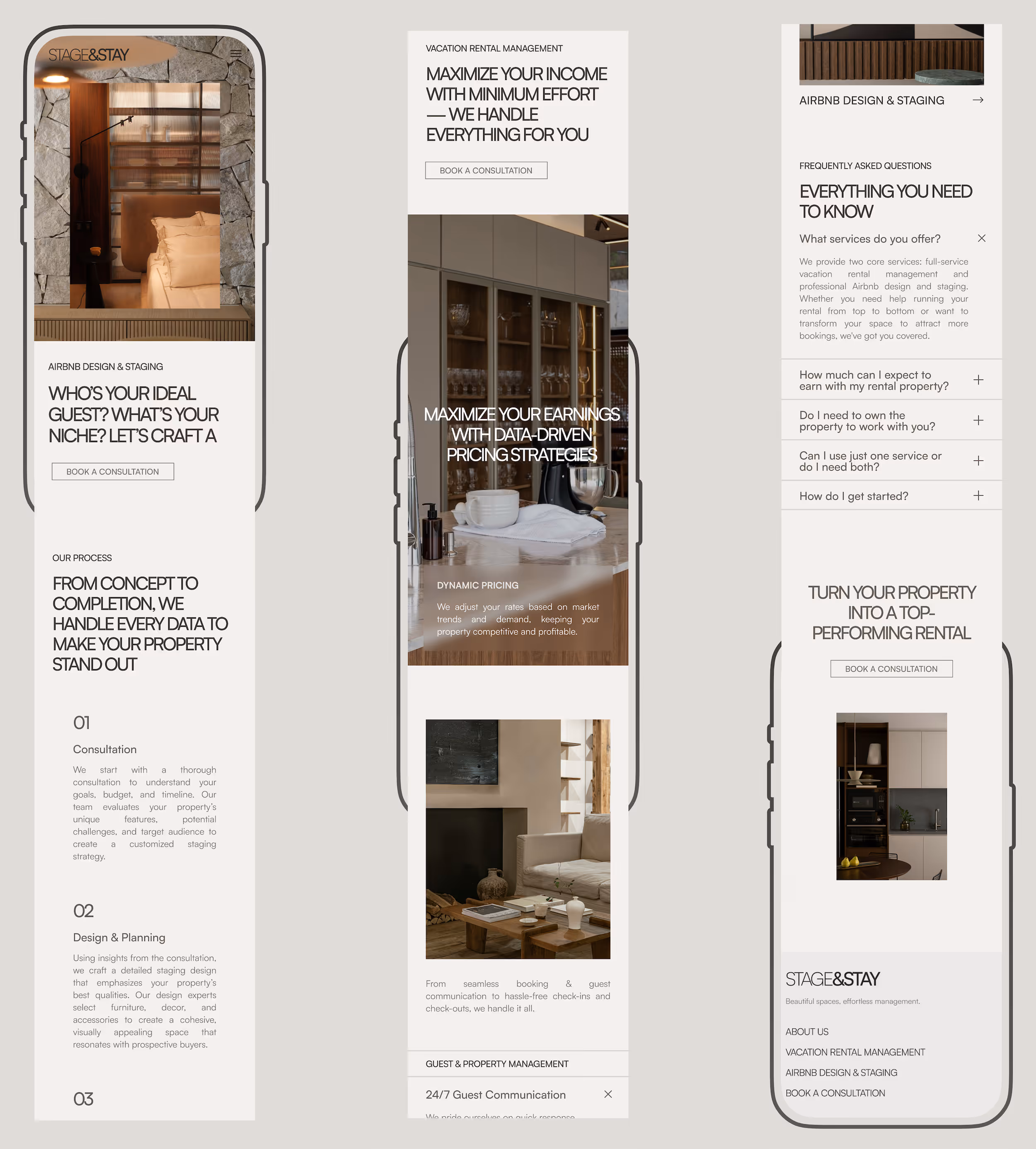
Each page follows a rhythm: bold headline overlaid on imagery, benefit-focused subheading, digestible content blocks, and strategic CTAs. This repetition builds familiarity as users navigate between pages, reducing cognitive load while reinforcing key messages.
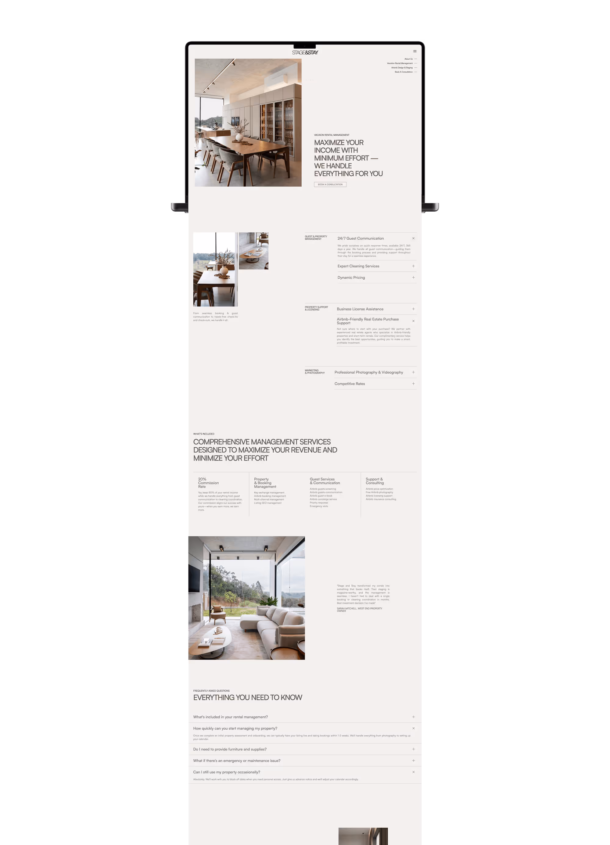
The design serves the messaging strategy at every level. Hero sections use overlay text on curated interior photography to immediately communicate value propositions, such as "Maximize Your Earnings with Data-Driven Pricing Strategies" and "Stand Out from the Competition with Expert Marketing." This approach helps visitors instantly understand benefits rather than wading through service descriptions.
Content is broken into scannable sections with clear hierarchy. Numbered lists guide users through processes, FAQ accordions hide complexity until needed, and statistics provide concrete proof of results. Every element answers the question: "What's in it for me?"
Service pages follow identical structures to create predictable, easy-to-navigate experiences. Visitors always know where to find what they need: hero benefit at top, detailed service breakdown in the middle, FAQs addressing concerns, testimonials building trust, and CTA prompting action. This consistency reduces friction and builds confidence because users don't have to relearn navigation patterns as they explore.
The homepage acts as a clear gateway, presenting both services with equal visual weight through side-by-side imagery. This balanced presentation communicates that Stage and Stay offers comprehensive solutions, whether clients need one service or both.
Every design decision supports the goal of moving visitors toward consultation bookings. CTAs are strategically placed at natural decision points: after explaining benefits, after showing social proof, and after addressing concerns.
FAQ sections preemptively address objections about cost, timeline, and service scope. Client testimonials are concise but positioned after service descriptions to validate claims with real voices. This layered approach builds trust progressively, removing barriers before they become deal-breakers.
Built in Webflow with mobile-first thinking, large hero images scale appropriately, text remains readable without zooming, and touch targets meet accessibility standards. The warm neutral palette ensures sufficient contrast for readability.
Results & Impact
Stage and Stay presents as an established, credible service through sophisticated design that differentiates it from competitors. The clear service positioning helps potential clients immediately understand the dual offering, while benefit-focused messaging addresses their core concerns: maximizing income and minimizing effort. The consistent CTA strategy creates a clear path to consultation bookings.
The site respects visitors' time by frontloading key information and making navigation intuitive. Property owners can quickly scan hero sections to understand services, dive into detailed breakdowns if they want specifics, or jump straight to FAQs for common questions. The editorial aesthetic suggests the level of design expertise they can expect, while concrete stats and testimonials build confidence in operational capabilities.
The messaging speaks directly to pain points: stress, time commitment, occupancy rates, revenue optimization. By leading with outcomes rather than features, the site connects emotionally before asking for commitment.
This conceptual project demonstrates how strategic UX/UI design transforms a service business into a compelling brand. The clean, editorial aesthetic elevates perception while maintaining approachability. The message-driven layout ensures every element serves both business goals and user needs. By balancing aspiration with practicality, Stage and Stay positions itself as the premium choice for property owners who want results delivered with sophistication.